
A strong visual identity is your most potent, non-verbal tool for securing promotions and higher-value projects.
- Consistency signals reliability and builds equity, making you a cognitively “easy” and trustworthy choice for decision-makers.
- Strategic color choices and a single “trademark” accessory create powerful authority signals that project competence without words.
- Your virtual presence, from your Zoom background to your “top-up dressing,” must be a seamless extension of this curated identity.
Recommendation: Audit your current visual signals not for ‘style’, but for ‘strategic impact’ on those who control your career trajectory.
In a saturated market, every creative freelancer and professional is told to “stand out.” The common advice is a predictable litany: get a logo, build a beautiful portfolio website, pick a color palette. This approach is fundamentally flawed. It’s designed to attract clients, but it completely ignores the real gatekeepers of your career advancement: the art directors, the department heads, the executive producers. These are the people who decide whether you get the high-profile project, the leadership role, or the promotion. They aren’t looking for a flashy brand; they are looking for signals of authority, reliability, and competence.
The conventional wisdom about personal branding is outward-facing. It’s about marketing. But what if the true key to leveling up wasn’t about shouting louder, but about signaling smarter? What if your visual identity wasn’t a brand, but a strategic uniform? This is the critical shift in mindset. You must stop dressing for the job you have and start building a visual signature for the position you want. This isn’t about being fake; it’s about being intentional. It’s about understanding the psychology of perception and using it to your advantage.
This guide deconstructs the process of building that strategic uniform. We will move beyond the superficial and dive into the mechanics of visual authority. We will analyze the power of consistency, the strategic selection of a trademark, the psychology of color, and how to translate your physical presence into a commanding virtual one. It’s time to weaponize your visual identity for career promotion.
This article provides a strategic framework for transforming your personal style into a career asset. Explore the sections below to master each component of a powerful visual identity.
Summary: A Strategic Guide to Your Professional Visual Identity
- Why changing your look every month confuses potential clients?
- How to choose one accessory that becomes your professional trademark?
- Navy Blue or Black: Which color signals more trust for consultants?
- The “Caricature Effect”: When does a signature look become a costume?
- 3 ways to translate your physical style into your Zoom background and avatar
- 3 necklace lengths that sit perfectly within the Zoom camera frame
- Bold prints vs. Neutrals: Which signals authority without aggression?
- How to Command Authority in a Zoom Meeting Through Your Top-Up Dressing?
Why changing your look every month confuses potential clients?
Changing your visual style constantly is the ultimate act of brand sabotage. In the mind of a client or a hiring manager, inconsistency equals unreliability. Every time you drastically alter your appearance, you force their brain to re-evaluate who you are. This creates cognitive dissonance and friction, making you a more difficult and less memorable entity to process. A consistent visual presentation, on the other hand, builds a powerful mental shortcut. You become instantly recognizable, and that recognition breeds familiarity, which in turn breeds trust. This isn’t just theory; it’s a proven business principle. Research shows that for 33% of businesses, brand consistency helps them boost revenue by 20% or more. While you’re a person, not a corporation, the psychological mechanism is identical.
Your goal is to become a low-risk, high-recognition asset. Think of it as building brand equity in yourself. Every consistent impression you make is a deposit into that equity account. Frequent changes are withdrawals that deplete your value and confuse your audience. This is about playing the long game. A strategic uniform, a consistent and recognizable style, communicates stability and focus. It tells the world that you are deliberate and in control, not chasing every fleeting trend. It signals that you have a clear sense of self and purpose, which are core attributes of a leader.
Case Study: Walt Disney’s Signature as a Visual Anchor
From the company’s inception, Walt Disney understood the power of a consistent visual anchor. He worked with artists to develop a highly stylized signature, which was then relentlessly applied across every touchpoint—movie titles, merchandise, park signage. This signature wasn’t just a logo; it was a promise of quality and magic. By maintaining this visual consistency for decades, the signature became one of the most valuable trademarks in the world. It proves that a single, unwavering visual element accumulates immense trust and recognition over time, a principle directly applicable to your personal visual identity.
The choice is stark: be a fleeting trend that is quickly forgotten, or become a timeless trademark that commands respect and recall. Your career trajectory depends on it.
How to choose one accessory that becomes your professional trademark?
A professional trademark is not about being flamboyant; it’s about being memorable through strategic repetition. As Wikipedia defines it, a trademark look involves “characteristic clothes or other distinguishing signs… making the person more recognizable.” The key is to select one—and only one—category of accessory to make your own. This “visual anchor” simplifies your identity and makes it potent. The goal is to have a single element that is uniquely associated with you. It could be distinctive eyeglasses, a specific style of watch, a unique lapel pin, or a particular type of scarf. The item itself matters less than its consistent and exclusive use.
When selecting this item, consider three criteria: authenticity, practicality, and scalability. It must feel like a genuine extension of you, not a costume. It must be practical enough for daily wear in your professional context. And it must scale visually—meaning it’s noticeable in person and, crucially, on a small video call screen. Avoid anything that is noisy, overly distracting, or could be perceived as unprofessional in a conservative setting. The perfect trademark accessory enhances your authority, it doesn’t shout for attention. It’s the period at the end of a powerful sentence, not an exclamation point.
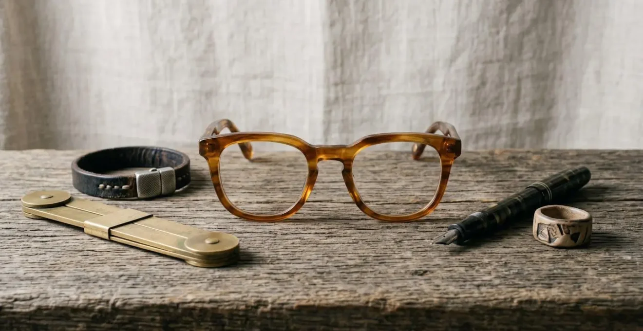
The image above illustrates a curated selection of potential anchors: each item tells a story and signals a specific kind of expertise. Your choice of a vintage fountain pen versus an architect’s brass tool communicates entirely different values. This is not just an accessory; it is a piece of non-verbal communication about your craft and your character.
Your Trademark Discovery Plan: A 5-Point Audit
- Signal Inventory: List all accessories you currently wear or own (watches, glasses, jewelry, pens, etc.). Identify every visual signal you are currently sending, intentionally or not.
- Consistency Audit: For the past month, which of these items have you worn more than 50% of the time? This identifies your “default” signals. Are any of them distinctive?
- Alignment Check: Juxtapose your top 3 most-worn items against your core professional values (e.g., “creativity,” “precision,” “reliability”). Does a plastic digital watch signal “precision”? Does a frayed bracelet signal “reliability”? Be brutally honest.
- Memorability & Uniqueness Test: Look at your chosen item. If you described it to a colleague, would they immediately know it was yours? Is it generic or does it have a unique quality (a specific color, shape, material)?
- Integration Roadmap: Select one item as your trial trademark. Commit to wearing it for every professional interaction for the next 30 days. Plan to acquire 1-2 variations of it (e.g., same glasses frame in a different color) to build a collection, not a costume.
Navy Blue or Black: Which color signals more trust for consultants?
While black is often the default choice for professional attire, it carries a significant risk of signaling severity, distance, and even aggression. It can create an unintentional barrier between you and your audience. Navy blue, however, operates in a more nuanced and strategically advantageous space. It is the undisputed champion for signaling trust. Extensive studies on color and perception show that navy blue is consistently associated with reliability, intelligence, and emotional stability—the holy trinity of consulting virtues. When you wear navy, you are subconsciously telling your clients and superiors that you are a safe pair of hands: dependable, smart, and calm under pressure.
The power of navy lies in its ability to project authority without the harshness of black. This is a critical distinction for any creative professional who needs to lead a project or persuade a client. As noted by fashion psychologists, navy is the color of “Authority Without Aggression.” It establishes you as a leader while maintaining an air of approachability. This makes it the ideal color for your “strategic uniform,” especially for key pieces like blazers or shells worn during high-stakes presentations or video calls. It commands respect without intimidating, fostering an environment of collaborative trust rather than adversarial command.
Authority Without Aggression: Navy conveys authority and competence without black’s potential severity. It signals leadership while remaining approachable—ideal for management and executive roles.
– Wessi Fashion Psychology, The Psychology of Color in Men’s Professional Wear
Choosing between black and navy is not a matter of style; it’s a calculated decision about the psychological signals you want to send. For a creative aiming for promotion, the message of approachable authority that navy provides is almost always the more strategic choice. It positions you as a competent partner, not a detached dictator.
The “Caricature Effect”: When does a signature look become a costume?
There is a fine line between a powerful signature look and a rigid, self-defeating costume. This is the “Caricature Effect”: the point at which your visual identity stops signaling authority and starts becoming a gimmick. A strategic uniform should feel authentic and adaptable, a natural extension of your professional persona. A costume feels forced, dated, and one-dimensional. The former suggests you are in control of your image; the latter suggests your image controls you. Steve Jobs’ black turtleneck was a uniform. An Elvis impersonator’s jumpsuit is a costume.
The danger zone is entered when your signature look becomes too theatrical, too literal, or completely inflexible. If your “trademark” is a specific, loud, 1980s-style power blazer, you risk looking like a character rather than a contemporary professional. The key to avoiding the Caricature Effect is to build your identity around a concept or a category, not a single, unchangeable item. For example, instead of wearing the *exact same* pair of red glasses every day for a decade, your trademark could be “bold, architectural eyewear.” This allows for variation in shape and shade while maintaining the core signal. This flexibility signals evolution and relevance, not stagnation.

Your look must serve your professional goals, not become a distraction. If people are talking more about your quirky outfit than your brilliant ideas, you have crossed the line into caricature. The most powerful visual identities are subtle. They whisper competence; they don’t scream for attention. Authenticity and comfort, as suggested by the image above, are the ultimate arbiters. A true signature look should feel as comfortable and natural as your own skin.
3 ways to translate your physical style into your Zoom background and avatar
In the modern creative landscape, your virtual presence is as important as your physical one. As research confirms, your appearance can significantly impact first impressions, credibility, and engagement in virtual meetings. Your Zoom background and avatar are not passive backdrops; they are active extensions of your strategic uniform. Failing to align them with your physical style creates a jarring disconnect that undermines your authority. Here are three methods to ensure a seamless translation:
- Background as an Environmental Signal: Your background should reflect the values your physical style communicates. If your style is minimalist and precise (e.g., neutral colors, clean lines), your background should be uncluttered, perhaps with a single piece of abstract art. If your style signals intellectual rigor (e.g., classic fabrics, a trademark fountain pen), a curated bookshelf is a powerful choice. A 2023 Durham University study highlighted by Science of People found that participants with plants or bookcases in their background were rated highest for trustworthiness and competence. Your background is your virtual office; design it with the same intentionality as your wardrobe.
- Avatar as a Static Trademark: Your avatar is your visual placeholder. It’s what people see when your camera is off. This should not be a vacation photo or a picture of your pet. It must be a professional headshot that reinforces your signature look. The photo should feature you wearing your trademark accessory (e.g., your specific glasses) and your core color (e.g., your navy blazer). This creates a consistent visual anchor, ensuring your authority signal persists even when you are not on screen.
- Color Palette & Texture Harmony: Look at the dominant colors and textures of your professional wardrobe. Are they warm or cool? Textured or smooth? These elements should be mirrored in your virtual space. If you favor natural fabrics like wool and linen, a background with wood elements or textured wall art creates harmony. If your palette is cool-toned neutrals, ensure your background lighting and decor avoid warm, yellow tones that would clash. This creates a visually cohesive and pleasing frame that centers you as the authority.
By treating your virtual space as a strategic extension of your personal style, you build a powerful, unified brand that commands respect both on and off-screen.
3 necklace lengths that sit perfectly within the Zoom camera frame
When it comes to “top-up dressing” for video calls, jewelry is not just an accessory; it’s a strategic tool for directing focus. The wrong necklace length can dip in and out of the camera’s view, creating a constant, unprofessional distraction. The right length, however, can frame your face, reinforce your authority signals, and complete your virtual strategic uniform. The key is to choose pieces that live comfortably and entirely within the typical webcam frame, which is a tight shot from the chest up. Here are three necklace lengths that are optimized for on-camera impact:
- The Collarbone Highlighter (16-18 inches): This is the workhorse of video call jewelry. A necklace of this length sits perfectly at the clavicle, just below the base of the neck. It’s ideal for drawing attention upward towards your face without competing with your words. It works seamlessly with the most common professional necklines, such as crew necks, boat necks, and modest V-necks, making it a versatile and reliable choice for daily video meetings.
- The Statement Sweet Spot (20-22 inches): Known as the ‘matinee’ length, this is the optimal choice for a bolder statement piece. At 20 to 22 inches, a pendant or larger element will rest on the upper part of the chest, ensuring it remains fully visible within the frame. This length allows you to showcase a piece of your trademark style (like an artisan pendant) without the risk of it disappearing off-screen as you move. It signals confidence and personality without overwhelming the composition.
- The Lariat Advantage (Y-Necklace): Lariat or “Y-style” necklaces are uniquely suited for the vertical format of a webcam view. The distinct vertical line of the necklace creates a subtle visual path that draws the viewer’s eye directly upward to your face—the center of communication. This style is an elegant way to add a point of interest and sophistication while actively reinforcing you as the speaker and focal point of the conversation.
By selecting jewelry with the camera frame in mind, you transform a simple accessory into a powerful component of your visual communication strategy, ensuring every element on screen serves to amplify your professional presence.
Bold prints vs. Neutrals: Which signals authority without aggression?
In a professional context, especially on a video call, your clothing is judged in an instant. In fact, snap judgments about your professional competence occur in just 130 milliseconds based on what you wear. In this split-second assessment, bold prints are a high-risk gamble. While they can signal creativity, they can also be visually distracting, aggressive, and can even create bizarre moiré patterns on camera. They force the viewer’s brain to work harder to process the image, pulling focus away from your face and your message. A busy print can signal chaos, not command.
Solid, structured neutrals are the secret weapon of the authority-seeking professional. Colors like navy blue, charcoal grey, and rich camel project stability, confidence, and focus. They create a calm, solid foundation that allows your face and your ideas to be the center of attention. As experts at Science of People advise, “Wearing solid, medium-toned colors helps you project authority and focus during high-stakes video calls.” Neutrals don’t compete for attention; they command it quietly. They act as a canvas, making your “visual anchor”—your trademark accessory or a pop of color in a scarf—even more impactful.
This doesn’t mean your look has to be boring. Authority comes from the combination of a solid neutral base with a single, deliberate point of interest. A sharp navy blazer (neutral authority) paired with a unique lapel pin (trademark accessory) is infinitely more powerful than a loud, floral blouse that fights for visual dominance. The former is a strategic uniform; the latter is just a piece of clothing. To command authority without aggression, let your ideas be the boldest thing on screen, supported by a wardrobe that signals unshakeable competence.
Key Takeaways
- Consistency is non-negotiable; a stable visual identity builds trust and cognitive ease for decision-makers.
- A single “visual anchor” or trademark accessory is more powerful and strategic than a complex or constantly changing wardrobe.
- You must translate your physical authority signals into your digital presence (Zoom, avatar) for a unified and commanding professional brand.
How to Command Authority in a Zoom Meeting Through Your Top-Up Dressing?
Top-up dressing—the art of styling yourself from the waist up for video calls—is not about looking good. It is a strategic exercise in commanding authority within the confines of a digital frame. In this limited visual space, every choice matters. Your ability to project competence and leadership is directly tied to the consistency and intentionality of your appearance. This isn’t vanity; it’s career strategy. Data on personal branding is clear: professionals with a consistent visual presence are perceived as more reliable and promotable. One study reveals that professionals with consistent branding experience 41% faster promotions and more leadership opportunities.
To command authority, your top-up dressing must adhere to three core principles. First, structure over comfort. While you might be wearing sweatpants below the camera’s view, what’s visible must be structured. A blazer, a collared shirt, or a blouse with a defined shoulder line creates a silhouette of authority. It frames your posture and signals that you are taking the meeting seriously. Second, color with intent. As we’ve discussed, solid neutrals like navy blue or charcoal grey project stability and competence. Avoid distracting patterns and opt for colors that make you the focal point. Third, anchor your look. Your trademark accessory—be it your glasses, a specific necklace, or a lapel pin—must be visible. This visual anchor provides continuity and reinforces your unique professional identity in every virtual interaction.
Virtual presence can significantly impact your professional brand. It’s important to ensure that you maintain consistency across all touchpoints when communicating. Be that in printed materials, social media and of course Zoom video conferencing too.
– Graham Baker Photography, My Top tips on how to look better on a Zoom video call
Your Zoom window is a stage, and you are the lead actor. Every meeting is a performance where you are either building or eroding your professional authority. By mastering top-up dressing, you ensure that every virtual appearance is a powerful step towards your next promotion.
Stop dressing for the job you have; start signaling for the promotion you deserve. This is not about a superficial makeover, but a strategic realignment of your visual assets. The first step is to conduct a ruthless audit of your current visual signature and begin making intentional choices. Your career advancement depends on it.