
Wearing a single bright hue isn’t a fashion risk; it’s a calculated power move to build your professional brand.
- The psychological impact of color is scientifically documented, allowing you to use hues like red to project dominance in high-stakes situations.
- Successful execution depends on mastering technical details like color saturation for office lighting and pairing vibrant tones with strategic neutrals.
Recommendation: Stop treating color as an afterthought and start building a deliberate “hue architecture” for your wardrobe to control your professional narrative.
For professional women in traditional sectors like law and finance, the wardrobe is a uniform of intent. The unspoken rule has long been a palette of muted grays, authoritative navies, and serious blacks. The idea of walking into a boardroom wearing a vibrant fuchsia or a bold cobalt blue feels less like a power move and more like a professional risk. The common advice—to add a “pop of color” with a scarf or a bag—feels timid, an apology rather than a statement.
This approach is fundamentally flawed. It treats color as a frivolous accessory rather than what it truly is: a powerful, non-verbal communication tool. The real question isn’t *if* you can wear a bright single hue in a corporate setting, but *how* you can leverage it with strategic precision. What if that crimson dress wasn’t a gamble, but a calculated tool to increase perceived dominance in a negotiation? What if mastering color theory could prevent your favorite blouse from making your teeth look yellow under harsh office lights?
This guide moves beyond the platitudes. We will not advise you to “start small.” Instead, we will arm you with the principles of a corporate style consultant, treating color as a strategic asset. We’ll deconstruct the science behind color perception, provide frameworks for execution, and offer the advanced tactics needed to transform your wardrobe from a shield of conformity into a billboard for your ambition. It’s time to stop blending in and start building a visual identity that gets you noticed—and promoted.
This article provides a complete playbook for mastering color in a professional context. The following summary outlines the key strategies we will explore, from the psychology of dominance to the art of building a cohesive visual brand.
Summary: The Strategic Use of Bright Hues in Corporate Fashion
- Why wearing red during a pitch increases your perceived dominance?
- How to choose the right saturation level for your office lighting?
- Color Blocking vs. Full Hue: Which is easier for fashion beginners?
- The undertone clash that makes your teeth look yellow
- 3 neutral accessories to ground a vibrant outfit instantly
- Navy Blue or Black: Which color signals more trust for consultants?
- 3 colors (other than black) that match 90% of office wardrobes
- How to Build a Visual Identity That Gets You Promoted in Creative Industries?
Why wearing red during a pitch increases your perceived dominance?
The notion that red is a “power color” is more than just a fashion cliché; it’s a psychological phenomenon rooted in cognitive science. When you wear red in a high-stakes professional setting like a client pitch or a board presentation, you are leveraging an implicit association that your audience has between the color and concepts of dominance and aggression. This isn’t just about feeling more confident; it’s about actively signaling authority before you’ve said a word. As color psychology experts Elliot and Maier note in their review, “Color and psychological functioning,” red has been empirically shown to enhance the perception of, among other things, dominance and aggressiveness.
This effect is measurable. Compelling research published in Frontiers in Psychology demonstrates that a link between red and dominance is pre-wired in our perception. In experiments, participants were quicker and more accurate at identifying “dominance” related words when they were displayed in red, compared to blue or gray. This cognitive shortcut means your red blazer is actively priming your audience to associate you with authority.
Case Study: The Olympic Red Advantage
The power of red as a dominance signal extends beyond the boardroom into elite competition. A famous study by Hill and Barton on combat sports at the 2004 Olympic Games found a fascinating correlation. Athletes who were randomly assigned to wear red gear were significantly more likely to win than their opponents in blue. This real-world example demonstrates that the unconscious bias toward red as a color of dominance is powerful enough to influence outcomes even at the highest levels of competition, a principle that translates directly to the competitive arena of corporate business.
Therefore, choosing to wear red is not a whimsical style choice but a strategic deployment of dominance signaling. It’s a calculated move to establish a perceptual advantage, particularly in situations where projecting authority and control is paramount to success. It’s the first step in building a wardrobe that actively works for your career goals.
How to choose the right saturation level for your office lighting?
The brilliant emerald green blouse that looked stunning in the boutique’s warm, ambient lighting can appear dull and lifeless under the cool, high-Kelvin fluorescent lights of a corporate office. This is the critical, often-overlooked factor of perceptual harmony: the interaction between a color’s saturation and the lighting environment. The right saturation level isn’t an absolute; it’s relative to where the garment will be seen. A highly saturated color might feel powerful and vibrant in natural light but can become jarring or “too much” under the harsh, blue-toned light common in many workplaces.
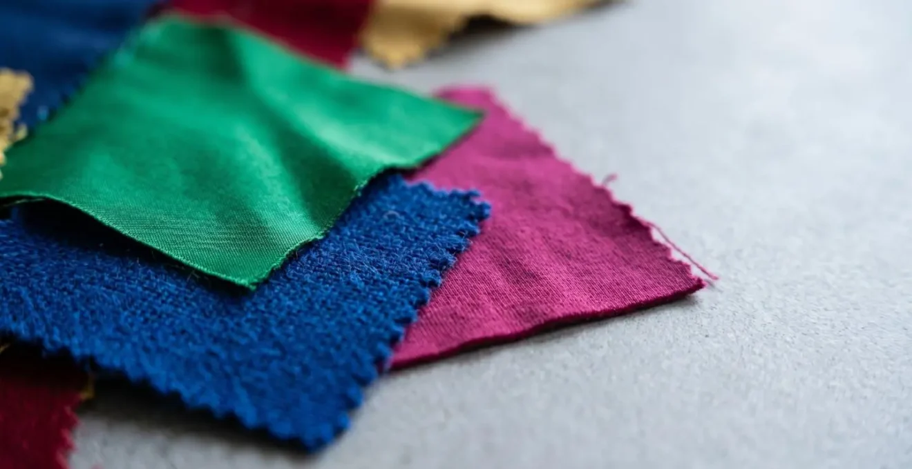
As the image above illustrates, different textiles and saturation levels react dramatically to lighting changes. The key is to test potential pieces in an environment that mimics your office. More light is not always better, and neither is a higher color temperature. In fact, a 2020 study in Sustainability found that a CCT of 4000 K was considered the optimum for lighting comfort and visual appeal in office settings, debunking the myth that ever-cooler, bluer light is more productive. A color that harmonizes with a 4000 K light will appear rich but not overwhelming.
For corporate environments, this means favoring colors with a medium to high saturation but steering clear of neons or fluorescent hues that can create visual dissonance under office lights. A deep jewel tone like sapphire or magenta holds its richness without vibrating unpleasantly. Conversely, a very low-saturation pastel might look washed out and insipid. The goal is to select a saturation level that maintains its intended character and visual authority within the specific context of your daily professional environment.
Color Blocking vs. Full Hue: Which is easier for fashion beginners?
For a professional eager to introduce bold color but wary of execution, the choice between a full, single-hue outfit and a color-blocked look is a primary strategic decision. A full-hue look—a monochromatic power suit, for example—is a high-impact, direct statement. Color blocking, which fashion historians define as combining “two or three different but complementary colors together in one outfit,” offers a more structured and arguably more creative path. For a beginner, color blocking is often easier because it provides a clear set of rules and can be scaled based on confidence.
A full-hue outfit requires perfect execution in tailoring and shade selection to avoid looking like a costume. Any flaw is magnified. Color blocking, however, allows you to use neutrals to ground the look, mitigating risk. The easiest entry point is to start with a single colored piece and pair it with your existing neutrals. From there, you can graduate to more complex combinations using a structured approach.
This “Hue Architecture” can be broken down into a simple pyramid, allowing you to build confidence and skill over time without risking a professional misstep. Rather than guessing, you can follow a clear roadmap from subtle integration to expert-level expression.
- Level 1 (Beginner): Monochromatic. The safest bet. Wear one color throughout the entire outfit but in different shades or textures (e.g., a light blue silk blouse with navy wool trousers). This minimizes execution risk while still creating a cohesive, intentional look.
- Level 2 (Intermediate): Analogous Colors. Combine colors that sit next to each other on the color wheel, such as a teal dress with a navy blazer. The result is harmonious and visually pleasing without being jarring.
- Level 3 (Expert): Complementary Colors. This is the classic, high-impact color block using colors from opposite sides of the wheel (like orange and blue). The key is the 60-30-10 rule: 60% of your outfit is the dominant color, 30% is the secondary color, and a mere 10% is a bright “pop” as an accent, often buffered by a neutral like camel or grey to maintain sophistication.
The undertone clash that makes your teeth look yellow
Here is an expert-level detail that separates the amateur from the strategist: understanding the subtle war of undertones. You’ve chosen a powerful, confident red lipstick to command a room, but when you pair it with your favorite mustard-yellow silk blouse, something is suddenly off. Your smile doesn’t look as bright; in fact, your teeth appear more yellow. This isn’t an illusion; it’s a predictable consequence of an undertone clash.
Every color has a temperature: a warm (yellow/gold-based) or cool (blue/pink-based) undertone. Your skin, your makeup, and your clothing all have these undertones. When they are in harmony, the effect is seamless. When they clash, they can bring out unflattering tones in each other. The yellow in a warm-toned blouse can perceptually amplify the natural yellow tones in your teeth, especially if you are wearing a lipstick with a conflicting undertone.
This is where strategic makeup and wardrobe pairing becomes critical. According to L’Oréal Paris Beauty Research, the effect is a matter of color science:
Cool-toned blue-based red lipstick can make teeth look whiter, but when paired with a warm, yellow-based top, the brain’s color perception gets confused and can amplify the yellow in both the shirt and your teeth.
– L’Oréal Paris Beauty Research, Color theory and teeth whitening lipstick analysis
The solution is twofold. First, identify your own skin’s undertone (cool, warm, or neutral) to choose the most flattering color families for you. Second, when constructing an outfit, ensure your key pieces and makeup share a harmonious undertone. If you’re wearing a cool-toned lipstick to brighten your smile, pair it with blouses in cool-toned colors like cobalt blue, fuchsia, or pure white, not ivory or a warm yellow. This level of detail ensures every element of your visual presentation is working in concert to project a polished, powerful image.
3 neutral accessories to ground a vibrant outfit instantly
Wearing a single, vibrant hue requires a counterbalance. Without a proper anchor, a bold color can feel overwhelming or ungrounded in a conservative corporate environment. The solution lies in deploying strategic neutrals through accessories. This isn’t about defaulting to black; it’s about choosing accessories whose material, structure, and color provide a specific kind of visual authority that supports, rather than competes with, your statement color.
The right neutral accessory acts as a visual “full stop,” signaling that while the color choice is bold, the overall presentation is professional, deliberate, and controlled. These accessories don’t just complete the outfit; they frame it, giving the eye a place to rest and reinforcing the professional context of your attire.
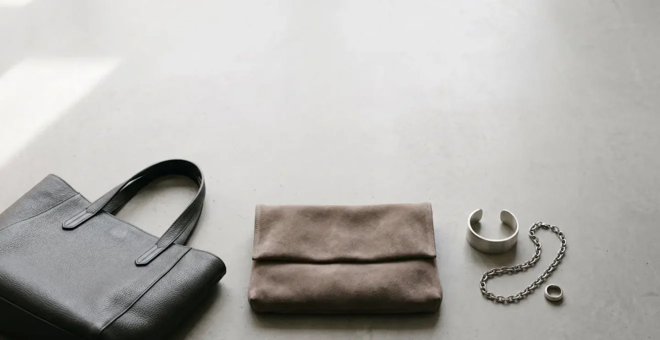
Instead of a random assortment, a curated trio of accessory strategies can provide the perfect anchor for any vibrant look. Each type offers a different flavor of professionalism, allowing you to tailor your approach to the specific message you want to send.
- A structured leather item (belt, briefcase, or loafers): Leather, especially in a structured form, is the ultimate signifier of traditional professionalism. A high-quality leather belt in charcoal grey or a structured tote in a deep brown immediately grounds a bright dress or suit, adding a layer of visual authority and connecting it to corporate heritage.
- A soft suede item (clutch, low heels, or crossbody bag): Where leather signals authority, suede suggests sophistication and approachability. A taupe or mushroom-colored suede clutch can soften the intensity of a vibrant cobalt blue or fuchsia, making the look feel luxurious and considered rather than just loud.
- A metallic item (watch, simple jewelry, or hardware details): Brushed silver, muted gold, or even gunmetal adds a modern edge and a touch of polish. A classic watch or a simple geometric necklace in a metallic finish acts as a point of light that complements the color without competing, signaling a contemporary and forward-thinking aesthetic.
Navy Blue or Black: Which color signals more trust for consultants?
In the lexicon of corporate attire, black and navy blue are the foundational pillars of authority. Both are seen as serious, professional, and safe. However, for roles that depend heavily on building client relationships and establishing rapport—such as consulting, finance, or law—the subtle difference between them can have a significant impact. While black projects absolute authority and power, navy blue is superior for signaling trust and dependability.
Black can sometimes be perceived as intimidating, formal, or even somber, creating a psychological barrier. Navy blue, on the other hand, carries much of the same authority but is perceived as more open and accessible. As the experts at Levinas Design put it, “The blue suit is number one in the business wardrobe. It’s the most official and serious element… A dark blue suit is a great alternative to a black one.” It communicates control and competence without the potential for intimidation that black can carry.
This isn’t just a stylistic opinion; it’s backed by research into color perception. Blue is consistently associated with stability, confidence, and intelligence. In fact, color psychology research confirms that people associate blue with dependability. In one experiment, participants rated websites with a blue color scheme as more trustworthy than identical sites in other colors. This cognitive bias translates directly to person-to-person interactions. When a consultant wears navy, they are subconsciously tapping into this deep-seated association, making them appear more reliable and trustworthy from the outset.
For a professional whose success is built on a foundation of client trust, choosing navy over black is not a minor detail. It’s a strategic choice to lower psychological barriers, foster a sense of reliability, and build rapport more effectively. It’s using your wardrobe to say “You can count on me” before the meeting has even begun.
3 colors (other than black) that match 90% of office wardrobes
Breaking free from a dependency on black as the default neutral is a pivotal step in developing a sophisticated and strategic professional wardrobe. While black is undeniably versatile, it can also be harsh and predictable. Expanding your palette of strategic neutrals opens up a world of nuanced, modern, and more approachable outfit combinations. These three colors possess the versatility of black but bring their own unique character, allowing for greater personal expression while maintaining the highest level of professionalism.
These alternatives work with nearly every color in a typical office wardrobe, from crisp whites and navies to the vibrant statement hues you are looking to incorporate. They provide a sophisticated foundation that can either stand alone or support bolder color choices, as detailed in the following analysis.
| Color | Strategic Position | Best Pairings | Professional Context |
|---|---|---|---|
| Olive Green | The Strategic Neutral – Modern and sophisticated alternative to grey | Pairs with navy, beige, charcoal; makes bright colors (pink, orange) pop in an earthy way | Tech, creative industries, modern corporate environments |
| Burgundy/Oxblood | The Rich Neutral – Weight of black with warmth and luxury | Beautiful with charcoal grey and navy for deeply professional looks | Finance, consulting, traditional corporate with personality |
| Chocolate Brown | The Comeback Neutral – Warmer, more approachable than black | Especially elegant when paired with cream or camel tones | Client-facing roles, relationship-building positions, retail leadership |
Integrating these colors into your wardrobe is a powerful move. An olive green blazer, a pair of burgundy trousers, or a chocolate brown leather tote can instantly elevate your look, demonstrating a command of color that goes beyond the basics. They signal a modern sensibility and a confident understanding of style that is both current and timelessly professional. By diversifying your neutral base, you create a more dynamic and flexible wardrobe that can be adapted to any professional context with ease and elegance.
Key Takeaways
- Red is scientifically proven to signal dominance, making it a strategic choice for high-stakes meetings.
- The impact of a color is dependent on its environment; always assess saturation under actual office lighting (ideally around 4000 K).
- Ground vibrant outfits with strategic neutral accessories—structured leather for authority, soft suede for approachability, and metallics for a modern edge.
How to Build a Visual Identity That Gets You Promoted in Creative Industries?
In any industry, what you wear communicates your ambition and competence. This effect is amplified in creative fields where personal brand and visual storytelling are currency. Simply “dressing well” is not enough. To get promoted, you need to construct a deliberate and consistent visual identity. This goes beyond a collection of nice clothes; it’s a cohesive personal brand translated into a uniform of intent. It tells your colleagues and superiors who you are, what you stand for, and where you’re going.
The impact of this strategy is not just perceived; it’s measurable. As one analysis highlights, there is a direct link between a strategic approach to professional appearance and career velocity. Studies in the United States found that workers who consciously curated their professional look were not only more likely to succeed but were 4 times more likely to advance than those who didn’t consider their appearance at all. Your visual identity is a key performance indicator for your career trajectory.
Building this identity is a systematic process, not a matter of guesswork. It involves auditing your natural assets, making strategic selections, and integrating them across all your professional touchpoints, from your daily wardrobe to your digital presence on platforms like LinkedIn. The following plan provides a roadmap for this process.
Your Action Plan: Building a Signature Color Strategy
- Audit Phase: Determine your skin undertone (warm, cool, or neutral). Use the vein test on your wrist (blue/purple veins suggest cool, green suggest warm) and compare how silver (cool) versus gold (warm) jewelry looks against your skin. This identifies which color families will naturally enhance your complexion.
- Selection Phase: Choose one or two signature statement colors that align with your personality and industry (e.g., a creative director might choose a vibrant teal, while a UX strategist might opt for a thoughtful olive green). Supplement these with three to four supporting neutrals (charcoal, navy, camel, cream) that will form the foundation of your professional uniform.
- Integration Phase: Translate this new visual identity consistently. This means not only building your wardrobe around this palette but also using it in your LinkedIn profile background, your personal portfolio website, and even your presentation templates for a completely cohesive personal brand.
- Investment Phase: Structure your purchases using the Wardrobe Pyramid model. The base should be a large collection of high-quality, timeless staples in your chosen neutrals. The middle layer consists of your signature color pieces in classic silhouettes (blazers, trousers, dresses). The small top layer is for trend-driven accent pieces that keep your look current.
By treating your professional appearance with this level of strategic rigor, you move from being someone who simply wears clothes to someone who wields a powerful visual identity. You create a memorable, authoritative, and promotion-worthy brand that speaks volumes before you ever enter the room.
Now is the time to transition from passive learning to active implementation. Begin by auditing your current wardrobe against the principles outlined here, identify your signature colors, and start building the powerful visual identity that reflects your ambition and expertise.