In summary:
- Build your outfit with “transitional potential” by focusing on light-responsive textures and tonal gradients, not just solid colors.
- Organize your closet by color gradient to create a grab-and-go system that simplifies morning choices and guarantees a cohesive look.
- Use low-contrast tonal pairings (e.g., beige and cream) for approachable daytime looks and high-contrast pairings (e.g., ivory and navy) for evening drama.
- Master “The 5 PM Shift”: a quick, 3-point accessory swap (footwear, bag, face-framing element) that transforms your look without a full change.
- Bridge slightly clashing tones with a patterned scarf that contains both shades, creating intentional visual harmony.
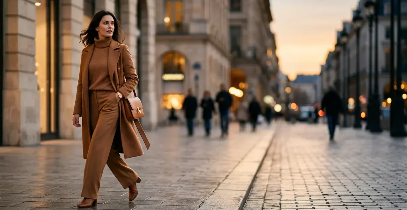
For the busy urban professional, the 5 PM rush is a familiar challenge. You have dinner plans, a networking event, or gallery opening straight after work, but no time for a complete wardrobe change. The common advice—swap your shoes, add a red lip—feels tired and often isn’t enough to truly elevate a day look. While a monochromatic outfit is a good starting point, simply wearing one color head-to-toe can sometimes fall flat, looking more uniform than chic.
The secret to a truly seamless transition isn’t about the frantic post-work swap. It’s about pre-engineering your outfit with what I call transitional potential. This is the art of choosing pieces in the morning that are designed to evolve with the changing light and context of your day. The key isn’t just color, but the sophisticated interplay between tonal gradients, light-responsive textures, and strategic layering.
But what if the real solution wasn’t in the accessories you pack, but in the foundational principles of the outfit itself? By understanding the subtle science of how different shades of a single color interact, how matte fabrics absorb light while satins reflect it, and how to create a visual column of color, you can build a look that feels appropriate for a 9 AM meeting and effortlessly chic for an 8 PM dinner reservation. This guide is built on that principle: strategic, efficient elegance.
In this article, we will deconstruct the art of tonal dressing, moving beyond the basics to give you a complete system. We’ll explore the science of color gradients, provide a blueprint for organizing your closet, and detail the precise accessory swaps that deliver maximum impact with minimal effort, ensuring you are perfectly poised for any occasion, at any time of day.
Summary: The Modern Guide to Tonal and Monochromatic Styling
- Why gradient colors hide figure concerns better than solid blocks?
- How to arrange your closet by color gradient to simplify morning choices?
- High Contrast vs. Low Contrast: Which suits low-key social events?
- The lighting mistake that makes your tonal blacks look like a mistake
- 3 ways to bridge two clashing tones with a patterned scarf
- Why wearing one color head-to-toe adds 2 visual inches to your height?
- When to switch from casual day to evening: The 5pm accessory swap
- How to Style Monochromatic Layers for Petites Without Looking Short?
Why gradient colors hide figure concerns better than solid blocks?
The power of tonal dressing extends far beyond simple color coordination; it taps into the very science of visual perception. While a solid block of color can sometimes highlight areas you’d prefer to downplay, a gradient or tonal look creates a soft, continuous flow that the eye follows smoothly. This effect blurs harsh lines and creates a more fluid, elongated silhouette. Instead of drawing attention to a specific point, the gentle transition of shades from light to dark guides the eye vertically, which is inherently flattering.
This isn’t just a fashion trick; it’s backed by perceptual science. The human eye is drawn to high-contrast edges. By minimizing these edges with a gradient, you create a look of seamless unity. Interestingly, research delves even deeper into how we perceive these transitions. For instance, as a 2023 study on gradient color perception shows, the direction of a gradient can influence our perception of stability. An upward gradient (darker shade on the bottom, lighter on top) can create a feeling of groundedness and visual balance.
In practical terms, this means you can strategically place darker tones in areas you want to recede and lighter tones where you want to draw focus, all while maintaining a cohesive and sophisticated aesthetic. This creates a much more nuanced and forgiving effect than the stark, unforgiving nature of a single, solid color block, giving you greater control over your overall visual presentation.
How to arrange your closet by color gradient to simplify morning choices?
An efficient day-to-night transition begins with an organized closet. Instead of grouping items by type (all pants together, all tops together), arranging your wardrobe by a color gradient system transforms your morning routine. This method allows you to see all your tonal options at a glance, making it incredibly simple to pull together a sophisticated, harmonious outfit in minutes. It’s a visual menu of perfectly coordinated pieces, eliminating guesswork and decision fatigue.
This system works by creating a visual flow from light to dark within each color family. Imagine your creams blending into beiges, then camels, and finally to deep chocolate browns. Or your sky blues deepening into periwinkle, cobalt, and finally navy. This not only looks beautiful but is intensely practical. You can instantly see which shade of grey works with your trousers or which ivory silk camisole pairs best with your ecru blazer. It turns the act of getting dressed from a chore into a creative, streamlined process.

By organizing this way, you are essentially creating pre-approved outfits. Any combination you pull from a single gradient section is guaranteed to have visual harmony. This is the foundation of an effortless, chic wardrobe that works as hard as you do. To get started, you can follow a simple audit of your existing clothes.
Your 5-Step Closet Gradient Audit
- Establish Your Base: Choose your primary neutral (like navy or black) and make it the anchor around which you’ll organize closet sections.
- Group Core Neutrals: Gather 5-8 coordinating essentials (whites, greys, beiges) that complement your chosen base color. These are your versatile connectors.
- Create Mini-Capsules: Build smaller groups using 2-3 accent colors (like blush, olive, or burgundy) that also coordinate with your base and neutrals, forming distinct color families.
- Sort by Undertone: Within each color family, separate items into warm and cool undertones. This prevents near-miss clashes (e.g., a blue-toned grey next to a yellow-toned grey).
- Prioritize Accessibility: Place your most-used gradient combinations—like your go-to work neutrals—in the most accessible “prime real estate” of your closet for quick morning access.
High Contrast vs. Low Contrast: Which suits low-key social events?
Once you’ve mastered tonal dressing, the next level of sophistication is understanding contrast. Not all monochromatic outfits are created equal; the level of contrast between your pieces sends a distinct psychological signal and determines the formality of your look. For low-key social events like a coffee meeting, brunch, or an intimate networking dinner, a low-contrast tonal outfit is your greatest asset. It communicates approachability and effortless confidence.
As fashion psychology experts note, there’s a clear reason for this effect. As highlighted in color psychology and fashion perception studies, low-contrast ensembles are perceived as softer and less intimidating.
Low-contrast tonal outfits (e.g., cream and beige) signal approachability and quiet confidence, ideal for networking or intimate gatherings.
– Fashion psychology researchers
A high-contrast tonal look—pairing ivory with a deep chocolate brown, for example—creates drama and authority. It’s powerful and statement-making, perfect for a cocktail party or an art gallery opening where you want to command attention. For more relaxed settings, however, the seamless blend of similar tones (like soft grey layers or a mix of cream and beige) fosters a sense of ease and connection. The following comparison breaks down the key differences.
| Aspect | Low-Contrast Tonal | High-Contrast Tonal |
|---|---|---|
| Color Example | Cream and beige, soft grey layers | Ivory and deep chocolate, white and navy |
| Psychological Signal | Approachability, quiet confidence | Drama, decisiveness, authority |
| Best For | Networking events, coffee meetings, intimate gatherings, Sunday brunch | Art gallery openings, cocktail parties, making an entrance |
| Event Energy Level | Low energy, relaxed settings | High energy, statement-making occasions |
| Versatility | Easy to transition with one accessory | Already dressed up, harder to tone down |
| Visual Effect | Elongates silhouette, creates seamless flow | Creates focal points, commands attention |
The lighting mistake that makes your tonal blacks look like a mistake
An all-black outfit should be the epitome of chic, but it’s also the easiest to get wrong. The common mistake isn’t the color itself, but a failure to account for lighting and texture. When you mix different black fabrics that have clashing undertones (e.g., a reddish-black pant with a greenish-black top), the result looks accidental and unpolished, especially under the varied lighting of a restaurant or bar. This is because different dyes and materials reflect light in unique ways, revealing their true base colors.
This is where understanding light-responsive textures becomes crucial. A matte fabric like wool or crepe absorbs light, creating a deep, flat black. A fabric with a sheen, like satin or leather, reflects light, appearing as a brighter, more dynamic black. A 2020 study analyzing around 1,000 images of dark clothing confirmed that fabric properties and lighting are huge factors in visual perception. Pairing a light-absorbing texture with a light-reflecting one creates deliberate, interesting contrast, not an accidental mismatch. The key is to make it look intentional.
To avoid the “mistaken mismatch” look, you must become a detective of undertones. The single most important step is to check your black pieces together in bright, natural daylight. If they look off in the sun, the discrepancy will be magnified under artificial lighting. For in-store purchases, a simple trick can save you from a future fashion faux pas. Here are a few expert tips to ensure your tonal blacks are always flawless.
- Test in Natural Light First: Before committing to an outfit, lay your black pieces out near a window. If they look mismatched in natural daylight, they will certainly clash under the varied lighting of an evening venue.
- Use the Phone Flashlight Trick: In a store or your closet, shine your phone’s flashlight directly onto the fabric held against a piece of white paper. This will instantly reveal its true undertone—be it blue-black, brown-black, or even purple-black.
- Mix Textures Deliberately: The safest and most stylish way to wear tonal black is by intentionally pairing different textures. Combine light-absorbing black velvet or wool with light-reflecting black satin or leather. This creates visual interest that reads as a conscious style choice, not an error.
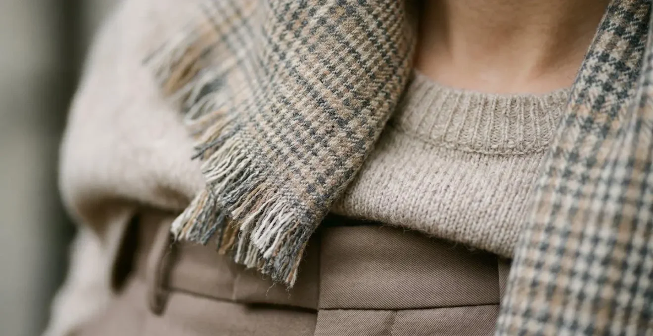
3 ways to bridge two clashing tones with a patterned scarf
Even with the most organized closet, you might find yourself with two pieces that are *almost* perfect together but whose tones clash just slightly—a cool-toned beige top with a warm-toned taupe pant, for instance. Instead of abandoning the pairing, the solution is to introduce a “bridge” piece. A patterned scarf is the ultimate tool for this job, acting as a visual mediator that ties the two disparate tones together into a cohesive whole.
The magic lies in choosing a scarf that contains both of the clashing colors within its pattern. This small accessory works to legitimize the color pairing, telling the eye that the combination is deliberate and harmonious. As fashion styling experts often advise, the scale of the pattern plays a critical role in how effectively it blends colors.
Pattern scale acts as a blender: small, busy patterns (micro-floral, tight geometrics) visually blend two similar but slightly-off tones, while large, graphic patterns better bridge two boldly different, clashing tones.
– Fashion styling experts
Here are three ways to use a scarf to masterfully bridge those tricky in-between shades:
- The Classic Drape: Simply draping the scarf around your neck allows the pattern to fall naturally over the junction between your top and bottom. It physically covers the point of contrast while its pattern creates a new, unified focal point.
- The Belt Tie: For a more integrated look, fold a silk scarf into a thin band and tie it through the belt loops of your trousers or around your waist over a dress. This brings the “bridging” pattern to the center of your silhouette, directly uniting the upper and lower halves of your outfit.
- The Bag Accent: If you prefer a more subtle approach, tie the scarf around the handle of your handbag. This introduces the unifying colors without placing them directly on your body, creating an echo of harmony that pulls the whole look together from a distance.
Why wearing one color head-to-toe adds 2 visual inches to your height?
The elongating effect of monochromatic dressing is one of fashion’s most reliable and celebrated principles. By wearing a single color or closely related tones from head to toe, you create an unbroken vertical line. The eye travels smoothly up and down the body without any visual interruptions that horizontal color breaks would create. This seamless column of color is what produces the powerful illusion of added height and a leaner silhouette.
This principle is a cornerstone of styling for a reason: it works by minimizing visual clutter. When you wear a different color on top than on your bottom, you effectively cut your body in half visually. A tonal outfit does the opposite; it unifies the figure into a single, cohesive shape. As research on monochromatic fashion demonstrates, this effect is universally flattering, streamlining the overall appearance.
To maximize this effect, pay attention to the details. Tucking in your top, choosing high-waisted bottoms, and matching your shoes to your trousers are all techniques that further enhance this vertical line. Even the choice of neckline can contribute; a V-neck draws the eye downward and lengthens the torso, amplifying the elongating power of your tonal color palette. It’s a simple, strategic approach that delivers a significant visual impact, making you appear taller and more poised.
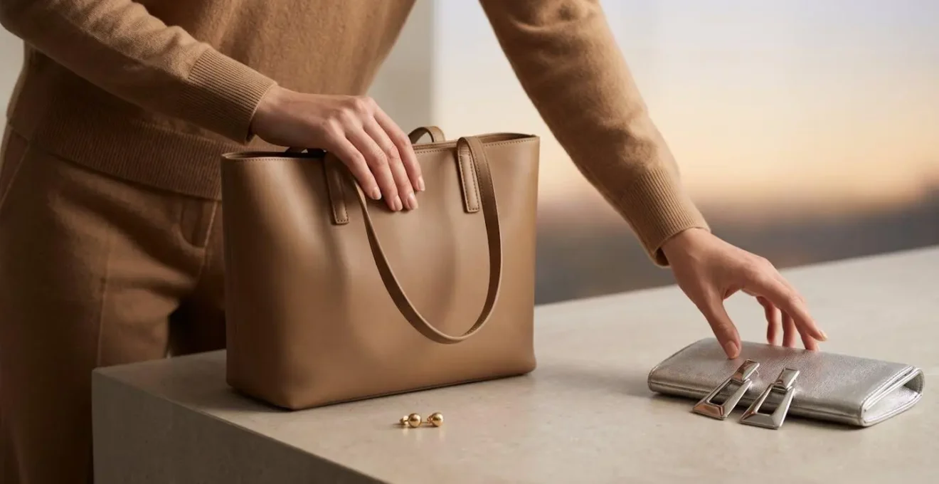
When to switch from casual day to evening: The 5pm accessory swap
The true magic of a day-to-night outfit lies in the efficiency of its transformation. This is what I call “The 5 PM Shift,” a strategic, three-point accessory swap that takes your look from professional and polished to evening-ready in under five minutes. The base of your tonal outfit remains the same; it’s the carefully chosen accents that change the entire mood and context of your look. This isn’t about a complete overhaul, but about targeted, high-impact changes.
The goal is to shift the outfit’s energy. Daytime accessories are typically about practicality and subtlety: a structured tote, comfortable loafers, minimal jewelry. Evening accessories are about drama, shine, and sophistication. The transformation happens when you swap matte textures for metallic ones, practical shapes for sleek ones, and daytime functionality for nighttime elegance. A desk drawer kit containing a few key items makes this transition effortless.
The most effective 5 PM Shift follows a simple, memorable rule that targets three key areas of your look for maximum impact. Think of it as your personal style algorithm for instant elevation.
The 3-Point Transformation Rule
- Footwear Elevation: This is the fastest way to change your posture and the feel of your outfit. Swap daytime loafers, sneakers, or flat boots for evening-appropriate heels, elegant pointed-toe boots, or embellished flats.
- Handbag Switch: Transition from your practical daytime tote or crossbody bag to a sleek evening clutch or a metallic mini bag. This shift in scale and material immediately signals a change in occasion.
- Face-Framing Focus: Draw attention upward by changing one element near your face. This could be letting your hair down from a daytime updo, adding a pair of statement earrings, or applying a bold lipstick.
Key takeaways
- The most effective day-to-night outfits are engineered with “transitional potential” through a mix of light-responsive textures (matte vs. shine).
- Organize your closet by color gradient, not item type, to create a system that makes pulling together a harmonious tonal look effortless.
- Master the “5 PM Shift”: a quick, 3-point accessory swap (footwear, bag, face-framing element) to instantly elevate your look for the evening.
How to Style Monochromatic Layers for Petites Without Looking Short?
For petite women, monochromatic dressing is a powerful tool for creating the illusion of height. However, layering can be a double-edged sword. While it adds dimension and interest, bulky or poorly proportioned layers can quickly overwhelm a smaller frame, counteracting the very elongating effect you’re trying to achieve. The secret for petites is not to avoid layers, but to be highly strategic about proportion and texture.
Successful petite styling is a game of inches, and successful monochromatic layering is about preserving the vertical line at all costs. This is a strategy mastered by famously petite and stylish figures like Victoria Beckham and Kim Kardashian. Fashion analysis of their outfits reveals a consistent use of monochromatic looks to create flattering vertical lines. They don’t just wear one color; they use meticulously chosen proportions and low-weight textures to maintain a sleek, unbroken silhouette.
The key is to create “visual pauses” without creating harsh horizontal breaks. This can be achieved with subtle flashes of skin or by choosing layers that are specifically cut for a smaller frame. Bulky fabrics are the enemy; instead, opt for fine-gauge knits, silk, and other lightweight materials that drape close to the body. Here are a few essential rules for petite monochromatic layering:
- Adhere to the Micro-Proportion Rule: Always choose cropped-length layers. A jacket or cardigan that hits at your natural waist is far more flattering than a standard hip-length piece, as it keeps your leg line as long as possible.
- Create a Strategic Skin Break at the Ankles: Pair cropped-length trousers with tonal footwear. The small sliver of skin showing at the ankle prevents the single color from looking too heavy or overwhelming on a small frame.
- Expose the Wrists: Push up the sleeves of your blazer or sweater, or opt for three-quarter length sleeves. Like the ankle break, this creates a subtle visual pause that adds shape without breaking the vertical color column.
- Prioritize Low-Weight Textures: Build your layers with fine-gauge cashmere, silk camisoles, and tencel knits. Avoid heavy, chunky cable-knits or thick wools, which add visual bulk and can make you appear shorter.
Now that you have the complete blueprint for mastering tonal dressing, start by auditing your closet this weekend. Identify one color family to organize by gradient and begin building your effortless, transitional wardrobe.